Where Data meets Decision-Making

When a local pizza shop started noticing inconsistent revenue and volatile rush hours, they started to ask themselves an important question:
What’s actually driving our sales // Are we leaving any money on the table?
This is when the store’s owner reached out to me, and asked for my expertise. He had all of the data necessary, thousands of orders and topping combinations.
But, as it often happens, the data was messy and didn’t provide any real business insights. That’s when I got to work.
The Business Problem
The shop wanted to know:
• Which pizzas are driving real revenue versus just order volume
• When customer demands peak by the hour and by the week to improve staffing decisions
• Which menu items are underperforming most often
• How order behavior affects average order value
These were questions that HAD to be answered in order to properly run the business, without these insights, important decisions will be largely driven by intuition.
Data & Tools
Tools Used
• SQL Server
• Tableau
• Excel
Dataset
• One full year of transactional pizza sales data
• Each record represents an order line item, for example, pizza type, size, category, quantity, price, and order date/time
Data Preparation & Analysis
Before starting with visualizations, the data was prepared and modeled to support the shop’s desired analysis:
• Aggregated transactional data using SQL
• Created calculated metrics for:
- Total Revenue
- Average Order Value
- Total Orders
- Total Pizzas Sold
• Structured data to perform:
- Product-level comparisons
- Time-based trend analysis (hourly/weekly)
- Performance ranking (best vs worst sellers)
Preparing the data in this manner allowed for the dashboards to include clean, reliable metrics rather than raw data
Dashboard 1: Business Performance Overview

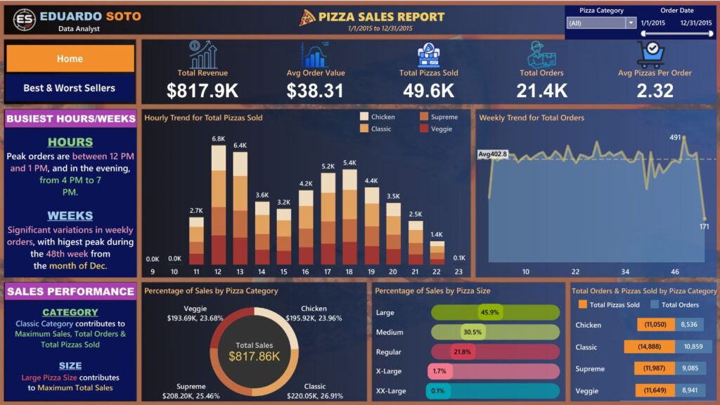
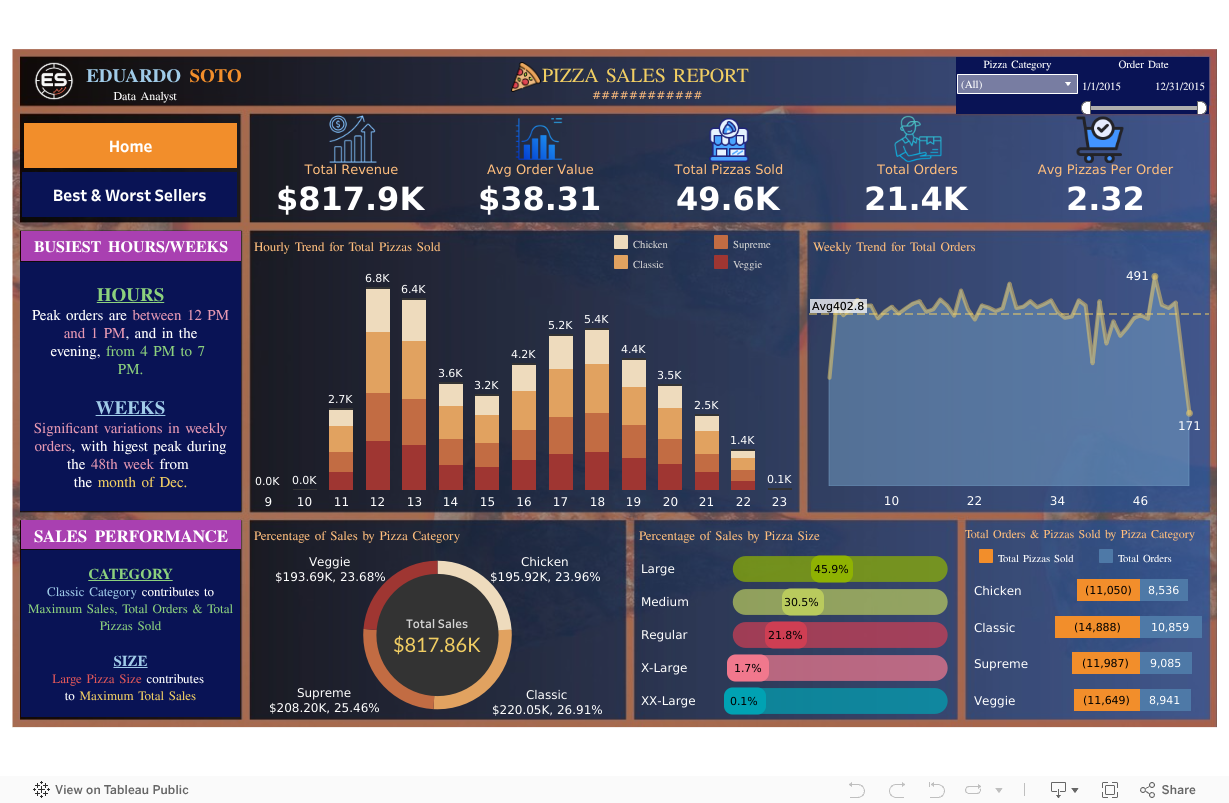
This dashboard provides stakeholders with an executive-level overview of the business
What This Dashboard Shows
• Key KPIs which summarize the overall performance of the business
• Hourly ordering trends which can be used to identify peak demand periods
• Weekly order patterns to spot seasonality or anomalies
• Clear sales distribution by pizza category and size
Key Insights
• Pizzas ordered peak around lunchtime (12-1PM) and the early evening (4-7PM)
• Large Pizzas generate the highest share of total revenue
• Weekly demand is fairly stable, with some predictable spikes
Business Value
This dashboard allows leadership to answer the following question:
“How is the business performing overall, and when does demand actually occur”
It will support decision-making in areas such as staffing, scheduling, and planning inventory.
Dashboard 2: Best & Worst Sellers Analysis

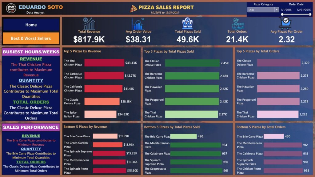
Rather than focusing on when sales occur, this dashboard shows what actually sells
What This Dashboard Shows
• Top and bottom pizzas ranked by:
- Revenue
- Quantity Sold
- Total Orders
• Side-by-side comparisons of the highest and lowest performing pizzas
Key Insights
Revenue ≠ Volume:
Some pizzas are generating high revenue, but that doesn’t mean they’re the most frequently ordered, this shows pricing power and the potential to upsell
A Small Group Drives Demand:
A set of certain pizzas accounts for a disproportionate share of total orders, this tells us that there’s a core menu that dictates customer behavior
Underperformers Across The Board:
Certain pizzas are consistently in the bottom ranks across all metrics, this tells us that customers have limited appeal in those categories
Business Value
This dashboard helps leadership answer the following question:
“What should we keep, further promote, or remove on the menu?”
It allows for data-driven decision-making instead of guesses based on intuition.
Hypothesis-Driven Insights & Recommendations
In order to best support the business, my next step was to move into decision support, I framed this analysis around four structured hypotheses
Hypothesis 1: Revenue Volatility is Driven by the Demand’s Timing, Not Declining Demand
Explored: Hourly and weekly order trends
Finding: The demand is highly concentrated during peak windows that are predictable
Conclusion: Revenue variability is more likely tied to the alignment of staff members rather than demand loss
What I Recommend:
• Increase staffing coverage during peak hours
• Better optimize labor allocation during the business’ low-demand hours
Hypothesis 2: Low-Performing Pizzas Hurt Menu Effectiveness
Explored: Bottom-ranking items across revenue, quantity, and total orders
Finding: Certain pizzas are consistently underperforming across all metrics
Conclusion: Having these low-performing items in the menu add complexity without making up for it in revenue
What I Recommend:
• Test re-pricing or repositioning these low-performers on the menu
• If after this test, performance does not improve, consider removing the items from the menu
Hypothesis 3: High-Revenue Pizzas Are Under-Realized
Explored: Revenue leaders versus order-volume leaders
Finding: Some of the high-revenue items are actually ordered less frequently
Conclusion: These items present the opportunity for the business to explore ways of increasing AOV
What I Recommend:
• Ramp up the promotion and marketing of high-revenue pizzas
• Create bundles including both high-revenue and high-volume items
Hypothesis 4: Customers’ Size Preferences Are Influencing Average Order Value
Explored: Sales distribution by pizza size
Finding: Large pizzas dominate revenue contribution
Conclusion: Customers are willing to purchase higher-value items
What I Recommend:
• Encourage customers to upgrade size by through value-framing
• Emphasize the advantages of ordering large-size items
Outcome & Impact
These dashboards were designed to compliment each other, together, they provide the business with a single source of truth for understanding the items’ performance
Stakeholders can now:
• Make data-driven menu decisions
• Align the staff’s schedules with actual demand
• Focus promotion and marketing on high-impact items
• Identify underperforming products
Skills Demonstrated
• SQL aggregation and KPI development
• Business-oriented dashboard design in Tableau
• Hypothesis-driven analytical thinking
• Translating raw data into actionable recommendations
• Client-style analytics storytelling
View the Interactive Dashboard

View the Technical Work
https://github.com/edusoto03/pizza-sales-analytics.git
This repository contains the SQL queries used to aggregate the data, calculate KPIs, and prepare the dataset used in the dashboard
Final Thoughts
This project was all about demonstrating that analytics go way beyond the numbers and messy data, when properly leveraged, it can be used to actively support business decisions.
While I definitely took my time to ensure the dashboards were visually appealing, the truth is that data analytics is not about flashy visualizations. It’s about asking the right questions, testing different hypotheses with the data, and helping the stakeholders act based on data and facts rather than intuition.
For those interested in the technical details behind my analysis, the full SQL logic and project documentation are available in the Github repository linked above.
